Signs, Signs, Everywhere are Signs
October 19, 2021
As the library’s visual design supervisor (aka, graphic designer), one of the most exciting aspects of the recent library renovation was designing new building signage. Having functional signage is integral to one of our core values, that of providing access. As is often the case in functional design, a well-considered system is rarely, well, considered. That is, if it works well, you don’t really notice it. (And you don’t get lost.) Because of the renovation, we needed to start over with every element of our signage system. Each element has to make sense on its own and as part of the whole.
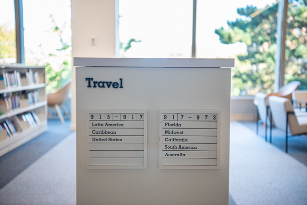
Endcap signage, used on shelves to denote which collections are housed there, uses a serif font.

Two types of signage for the Cosmos Room, including the ADA compliant signage, with braille, on the right.
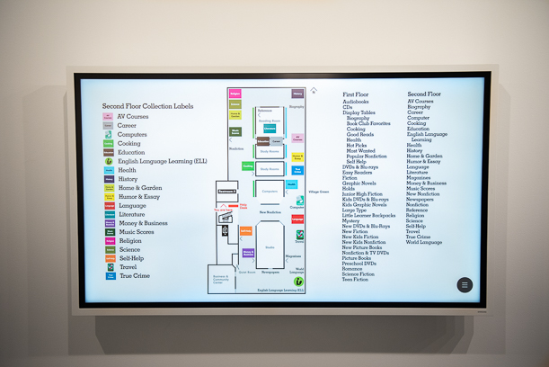
Digital directories, which show the locations of different collections on a map, needed to be designed in conjunction with the other signage in the building.
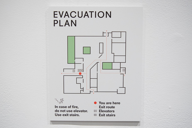
Evacuation plans also needed to be designed to fit with the other signage throughout the building.
Our library building is massive—before the pandemic, it could be challenging to design a summer reading experience elaborate enough to stand out in the space—so our signage needs are extensive. Almost all of our new signs required us to test type size, location, and height the old-school way, by printing them on paper and taping them to walls. We also had to work with a variety of fabricators and installers.
Here are some of the types of signage we worked on:
- Collection categories
- Collection subcategories
- Endcap signage
- Navigational signage
- Room signage (both the fancy version and the legal version that meets ADA standards and includes braille)
- Staff signage
- Restroom signage
- “Distraction” graphics (keep reading!)
- Digital directories
- Paper maps
- Checkout screens
- Catalog screens
- Display screens
- Evacuation maps
- Help desks
- Even trash/recycling bins
Along with our architects, we worked with Neil Donnelly Studio—which did the lion’s share of the work—to create this new look and feel for navigating the renovated space.
One early idea for signage was to use two different fonts to mark the different eras of the building. This intrigued me, because the history of our building is fascinating, especially if you are a midcentury modern buff like I am. Eventually, we decided to use our two fonts to distinguish collections from spaces. It was the right move, though I am still a big fan of the “easter egg'' embedded in that earlier concept. When you are in the library, notice that we use a sans-serif font (letters have no embellishments) for our physical spaces (Cosmos Room, Petty Auditorium, Quiet Room) and a serif font (letters have decorative "feet") for collections (Science Fiction, Most Wanted, Dinosaurs).

Two types of fonts were used to differentiate physical spaces from collections. On the left, a sans-serif font for the Studio space. On the right, a serif font for the audiobooks collection.
Another subtle design element is the dot-grid system. You may notice the white dots on many of our glass surfaces—called "distraction" graphics—that help delineate spaces with glass walls (like in our study rooms) and keep you from walking into them! In addition to dots and grids having a lifetime of relevance in libraries—think Dewey decimal numbers and databases—the dots and grids have extra meaning in the new space.
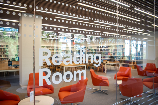
Where the primary activity is reading, the dots form horizontal lines (like in the Reading Room, above).
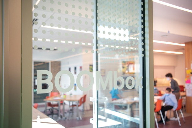
In maker spaces, all the dots in the grid are present.
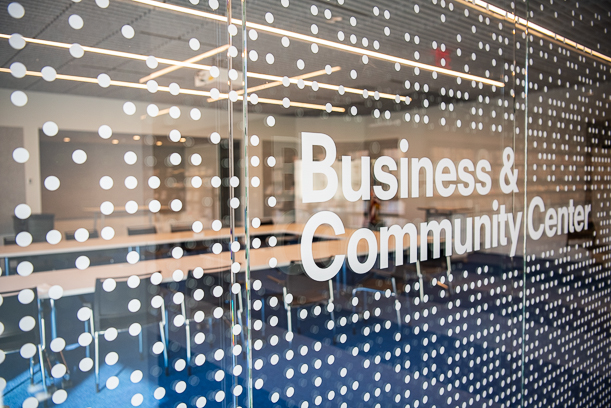
In gathering spaces (like the Business and Community Center), the dots are more random.
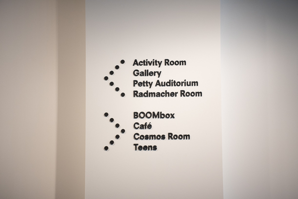
Directional arrows also use the grid system.
I loved being a part of creating the new signage system. And I am excited to continue to use our new system as needs arise. I do have one claim to fame from this process. The section dividers in certain sections, like movie genres, have always looked a little like cleavers to me. But during a discussion, I couldn’t think of the word “cleaver," so I called them “hatchets.” And wouldn’t you know it, the name stuck. We’ll just keep that between us though, and if you overhear someone talking about hatchets in the library, you’ll know not to worry.
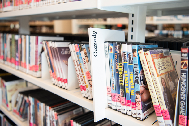
A comedy "hatchet" on the DVD and Blu-ray shelves.